
Mechanism explainer
Which Dark Farrow & Ball Paint Colors Help You Sleep?
Discover which dark Farrow & Ball paint colors are backed by color-psychology research to support better sleep, and why cool blues and greens outperform very dark purples and blacks for a restful bedroom.
The best dark Farrow & Ball paint colors for bedroom sleep sit in the cool blue, blue-green, and smoky green families: Hague Blue, Inchyra Blue, Green Smoke, De Nimes, and, with a little more caution, Railings. They are not sleep aids in the clinical sense. They are better understood as environmental choices: colors that may help the bedroom feel quieter, less stimulating, and easier to settle into at night.
That distinction matters because “dark” and “restful” are not the same thing. Sleep Foundation’s color-psychology guidance links blue with reductions in heart rate and blood pressure, green with comfort and peace, and black with more difficult emotional associations including depression, sadness, anger, and fear.[1] BetterSleep similarly describes green as a restful color and connects it with lower cortisol in nature-viewing research.[2] Casper’s bedroom color discussion also treats blue and green as stronger sleep-supportive choices than dark purple, while noting a Travelodge survey in which blue bedrooms were associated with the longest reported sleep.[3]
| Rank | Farrow & Ball shade | Why it belongs on the sleep shortlist | Best fit |
|---|---|---|---|
| 1 | Hague Blue No.30 | Deep blue with green undertones; strong color-family support without becoming a true black. | Bedrooms that can take drama but need a cool, settled feeling. |
| 2 | Inchyra Blue No.289 | Blue-grey-green character and a documented cocooning design read. | Rooms where the goal is enveloping rather than theatrical. |
| 3 | Green Smoke No.47 | Smoky green gives depth while staying in the comfort-and-restfulness color family. | Bedrooms that need softness, especially with natural materials. |
| 4 | De Nimes No.269 | A quieter blue option than Hague Blue; less severe, easier to live with. | Smaller rooms, north-facing light, or anyone nervous about going very dark. |
| 5 | Railings No.31 | A soft blue-black, not a flat true black; useful when the blue undertone stays visible. | Color-drenched rooms where the finish and lighting are carefully controlled. |
Why Blue And Green Lead The Shortlist
The available evidence is stronger at the color-family level than at the proprietary-paint level. There is no published randomized controlled trial showing that Hague Blue changes sleep architecture differently from De Nimes. What we do have is a useful pattern: cooler blues and greens are repeatedly associated with calmer physiological or emotional responses, while some very dark hues carry more emotionally charged associations.
Blue earns its place first because it is the color most often tied to sleep-supportive calm. Sleep Foundation states that blue can reduce heart rate and blood pressure, two measures that matter because the body is trying to downshift before sleep.[1] Casper’s article cites the much-repeated Travelodge survey finding that people in blue bedrooms reported the longest sleep, but that should be read as a survey signal rather than clinical proof; the methodology is not the same as a controlled sleep study.[3]
Green is the second strong family because it tends to feel restorative rather than dramatic. Sleep Foundation associates green with comfort and peace, while BetterSleep links green with restfulness and lower cortisol in research connected to viewing nature.[1][2] In a bedroom, that matters more than whether the shade looks impressive in a daytime photograph. A deep green that helps the nervous system read the room as sheltered is more useful than a dark color chosen only because it looks expensive.
1. Hague Blue: The Strongest Dark Farrow & Ball Choice For Sleep
Hague Blue is the most convincing answer when someone wants a dark Farrow & Ball bedroom that still has sleep logic behind it. Farrow & Ball describes Hague Blue as a deep navy with green undertones, which is exactly why it works better than many near-black alternatives: it has weight, but its color identity still belongs to the blue-green side of the palette.[4]
That green undertone is not a decorative footnote. It keeps the color from becoming a hard, sealed-off navy and gives it a quieter, more organic cast under evening light. In a bedroom, Hague Blue is best when the rest of the room is allowed to stay low-contrast: soft bedding, warm dim lamps, and little shine. White trim can look crisp, but too much sharp contrast can make the room feel more graphic than restful.
The one caution is intensity. Hague Blue is deep enough to dominate a small room, especially if the lighting is cool or the paint finish reflects lamp glare. If the room already feels compressed, Hague Blue may still be right, but it needs a matte finish and gentle lighting rather than bright overheads.
2. Inchyra Blue: Cocooning Without Going Fully Navy
Inchyra Blue is the shade I would put in front of anyone who likes Hague Blue but worries about the room becoming too formal or heavy. Farrow & Ball’s dark bedroom inspiration describes Inchyra Blue as creating “a cocoonlike feel,” and that word is unusually useful here because it describes a spatial effect, not just a mood-board adjective.[5]
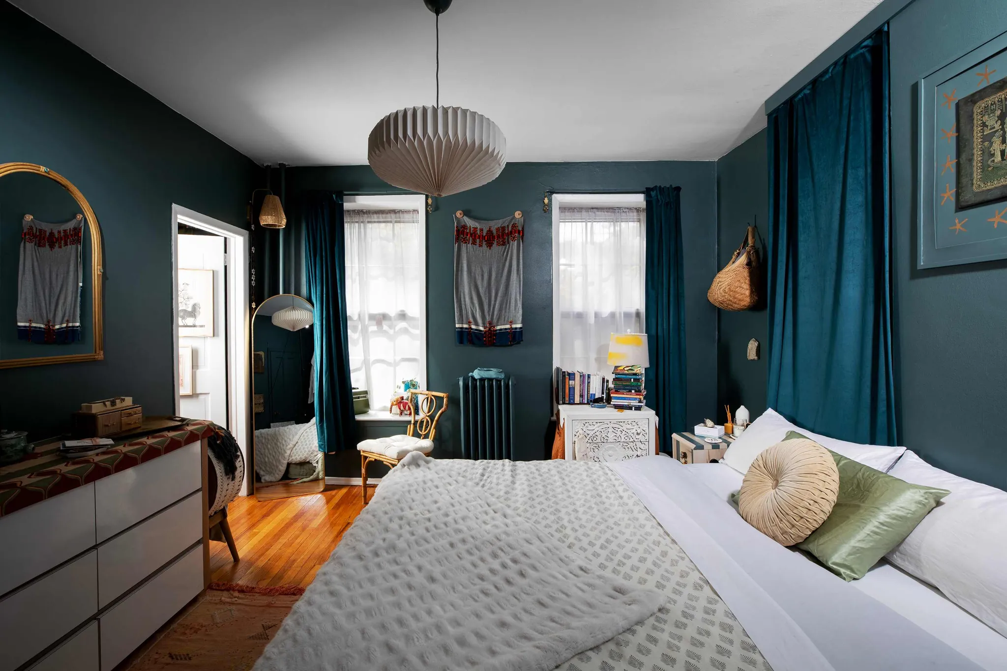
The sleep argument for Inchyra Blue is not that this exact formula has been tested in a lab. It is that the shade stays in the blue-green-grey territory most consistent with the calmer color-family evidence, while its muted quality reduces visual insistence. It can make the room feel enclosed without making it feel staged.
Inchyra Blue is especially good in bedrooms where daylight changes the walls across the day. It can read greener, bluer, or greyer depending on exposure, which is sometimes treated as a complication. For sleep, that mutability can be an advantage: the room does not hold a single theatrical note from morning to night.
3. Green Smoke: The Gentler Dark Green
Green Smoke is the best Farrow & Ball choice when the bedroom needs depth but not the nautical or inky feeling of a dark blue. It is dark enough to make the walls recede, yet smoky enough to avoid the alertness of a cleaner, brighter green. That places it neatly inside the evidence-supported green family without making the room feel like a themed “nature” interior.
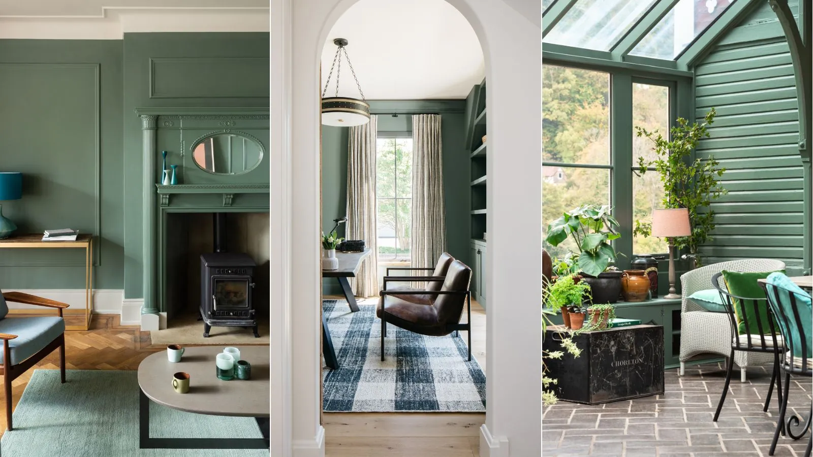
This is where the green research is most usable. BetterSleep’s discussion of green emphasizes restfulness and lower cortisol in connection with nature-viewing evidence, while Sleep Foundation frames green as a comfort-and-peace color.[1][2] Green Smoke will not reproduce the physiological effects of a forest view, but it can borrow some of the same low-stimulation cues: muted, organic, and less emotionally sharp than black or purple.
Green Smoke also tolerates ordinary bedroom materials well. Wood, linen, wool, and off-white bedding tend to soften it further. The point is not to decorate the color into submission, but to avoid pairing it with high-contrast accents that make the room visually busy at the exact hour it should be getting quieter.
4. De Nimes: The Safer Blue For Sensitive Rooms
De Nimes belongs on the shortlist because not every bedroom can carry Hague Blue or Railings. It is still a blue, and therefore still benefits from the broad color-family evidence, but it does not push as hard toward drama. For many sleepers, that restraint is the point.
Choose De Nimes if the room is small, the ceiling is low, the daylight is limited, or the person sleeping there is sensitive to heavy interiors. A bedroom can be too dark in practice even when the color family is theoretically right. De Nimes gives the eye somewhere to land without demanding the same level of commitment as a deep navy.
It is also a sensible compromise for shared bedrooms. One person may want a dark cocoon; the other may worry the room will feel gloomy. De Nimes keeps the calming blue association without forcing the space into full evening mode all day.
5. Railings: A Qualified Yes, Because It Is Blue-Black
Railings is the most conditional recommendation here. Farrow & Ball describes it as a soft blue-black, and that softness is the whole reason it remains on the list.[6] A true black bedroom asks more from the sleeper emotionally; a blue-black can still read as cool, contained, and enveloping when handled carefully.
The case for Railings improves when it is used as part of a fully considered room rather than as a single dramatic wall. Architectural Digest has quoted designers discussing cocooning and color drenching as ways to create calm, enveloping rooms, and that logic suits Railings better than a high-contrast accent-wall treatment.[7] Homes & Gardens has also described Railings as ideal for a cocooning bedroom, which aligns with its design use even if it does not prove a sleep outcome.[8]
The risk is that Railings can tip into severity. If the room has glossy surfaces, bright white trim, exposed cool bulbs, or a lot of reflective metal, the color may feel sharper than intended. It is best for people who want a very dark bedroom and are willing to control the finish, lighting, and contrast.
The Dark Farrow & Ball Shades I Would Hold Back
Brinjal and Pelt can be beautiful bedroom colors, but they are not the strongest sleep-first choices. Casper’s discussion includes color-therapy consultant Suzy Chiazzari’s warning that dark purple can be mentally stimulating and may contribute to vivid dreams.[3] That is not enough to declare every purple bedroom bad for sleep, but it is enough to downgrade very dark purple when the buyer’s main goal is rest.
Pitch Black and Off-Black have a different problem. Darkness itself can support sleep when it reduces light exposure, but a black wall color is not the same thing as a dark room. Sleep Foundation’s color guidance associates black with depression, sadness, anger, and fear, which makes true black a more complicated bedroom choice than its sleek reputation suggests.[1]
There are exceptions. A black or purple bedroom may feel deeply comforting to a particular person, especially with excellent lighting and soft textures. But if the question is which dark Farrow & Ball colors have the best evidence-aligned chance of supporting sleep, the blue, blue-green, and smoky green shades are the more defensible starting point.
How Much Should You Trust The Sleep Claims?
Trust the direction, not the certainty. The strongest material supports blue and green as calmer color families; it does not prove that painting a bedroom Hague Blue will increase deep sleep or reduce awakenings. Paint color sits among other sleep-environment factors: darkness, temperature, noise, bedding comfort, evening light exposure, and routine.
The survey evidence should also be kept in its proper place. The Travelodge finding about blue bedrooms is interesting because it matches the broader blue-is-calming pattern, but it remains a hotel-chain survey rather than a clinical sleep study.[3] A January 2025 survey reported secondhand by Elle Decor said 38% of Americans slept better after changing bedroom color, but the original Sleep Review Magazine survey was not directly verifiable from the materials available here.[9]
That does not make the choice meaningless. Bedrooms are behavioral spaces. A color that lowers visual noise, reduces glare, and makes the evening routine feel less activated can support the conditions around sleep, even if it is not directly changing sleep stages.
Finish Matters Almost As Much As Shade
For a sleep-focused bedroom, choose the flattest practical finish. Casper and Sleep Foundation both advise flat or matte paint over glossy finishes because shine reflects light, and reflected light works against the low-stimulation effect these colors are meant to create.[1][3] Farrow & Ball’s Dead Flat finish fits that logic well, especially on walls and woodwork where a seamless, low-sheen envelope is the goal.
- Use matte or flat finishes where durability allows, especially near lamps and windows.
- Avoid glossy trim if it creates sharp contrast or catches bedside light.
- Test the paint at night, not only in midday light.
- Look at the sample with the bulbs you actually use before bed.
- Judge the room from the bed, not just from the doorway.
If you want the clearest sleep-supportive answer, start with Hague Blue or Inchyra Blue. If you want something gentler, move to Green Smoke or De Nimes. If you want the deepest, most enveloping room and can control the lighting carefully, consider Railings. Be slower with Brinjal, Pelt, Pitch Black, and Off-Black when the goal is not just drama, but rest.
References
- What Color Helps You Sleep?, Sleep Foundation
- Bedroom Color Psychology and Its Impact on Sleep, BetterSleep
- The 10 Best (+ Worst) Bedroom Colors for Sleep, Casper
- Hague Blue, Farrow & Ball
- Dark bedrooms inspiration page, Farrow & Ball
- Railings, Farrow & Ball
- Designer commentary on cocooning and color drenching, Architectural Digest
- Railings called ideal for a cocooning bedroom, Homes & Gardens
- January 2025 survey via Elle Decor, Elle Decor, January 2025
Supports these guides
Spot an error or have clinical feedback?
Because this article covers clinical, medication, or safety information, we use a moderated correction channel instead of open public comments. Let us know if something about “Which Dark Farrow & Ball Paint Colors Help You Sleep?” needs a closer look.
Send feedback on this article